Brief
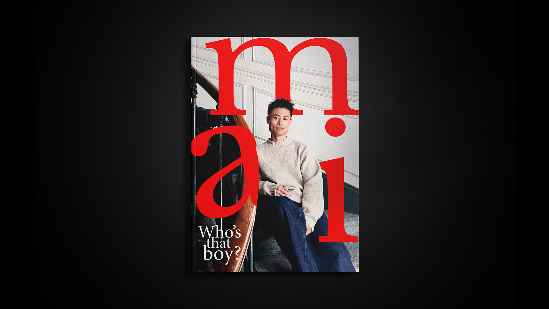
Slightly reinterpret AMI Alexandre Mattiussi by simplifying the logo and bringing focus back to the original core of the brand.
Insight
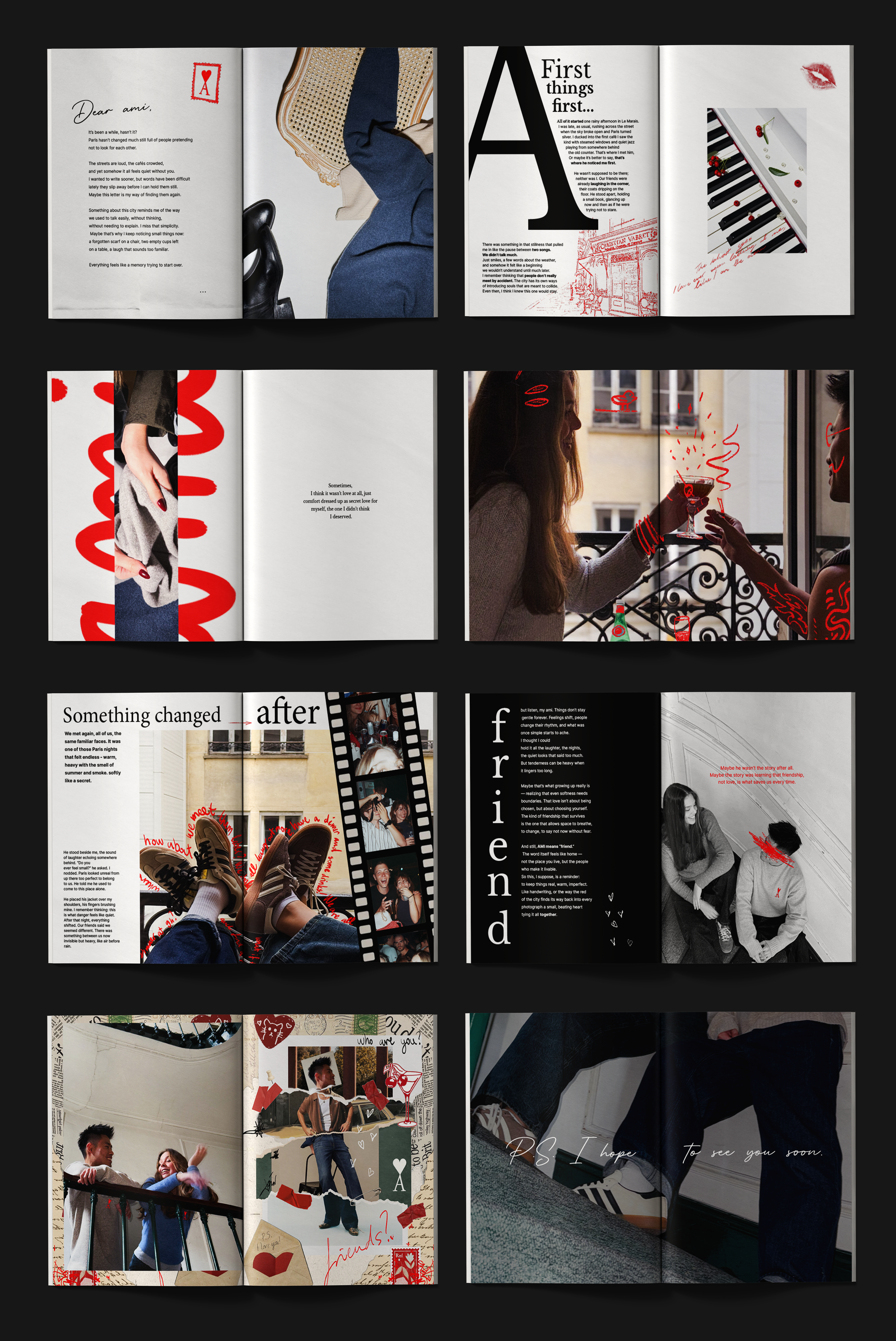
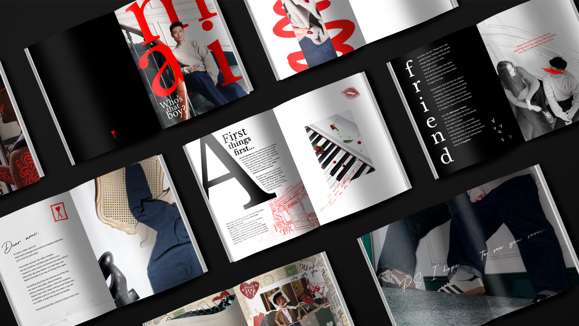
Ami means friend and the brand already carries a strong emotional symbol through its red Ami de Cœur logo. The idea was to bring more importance to that red color and use it as a visual link between the brand, the story and the feeling of connection.
Idea
The editorial was imagined as a letter to a friend. Through photography, illustration and simple visual elements, it follows a small story about warmth, closeness and the importance of human bonds, while creating a friendly emotional link between the brand and its audience.